Version 1.7 Advanced graphics
With this version, we took the time to centralize the most common behaviors we've ever coded for statistics.
In this version, you'll discover modern components like TreeMap and HeatMap, along with advanced features such as annotations and forecasting.
SmartPlatform 1.7 will take your reporting screens to the next level!
Rather than give you a technical list, we've worked our Graphics extension documentation by taking a needs-based approach, with the aim of recommending the most suitable chart.
List of added graphics
Standard components
In this version, we've enhanced our basic components to make them easier to integrate into projects.
- Camembert
- Half donut
- Donut
- Column chart
- Line chart
- Radar
- Polar radar
- Half-circle gauge
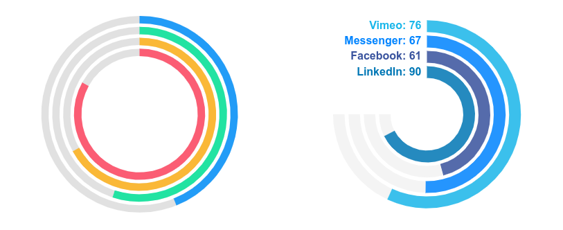
We've expanded the gauge possibilities to include formats with multiple indicators.
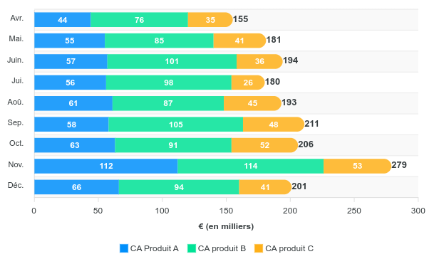
We've also integrated the ability to view a breakdown on our bar and column charts:
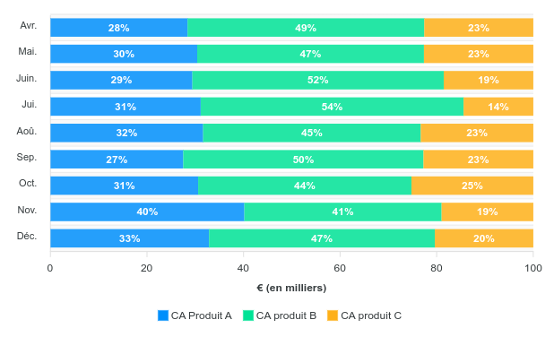
with the option of displaying in percentage mode
New graphic components
With this version, we wanted to integrate other types of modern graphics to visualize distributions in a more visual way.
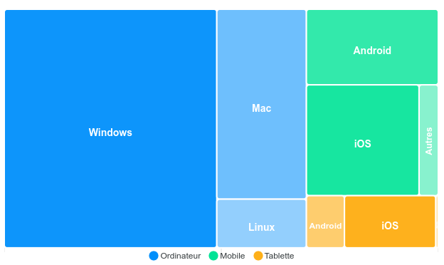
TreeMap
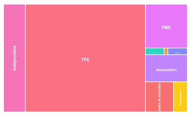
With the option of displaying multiple dimensions
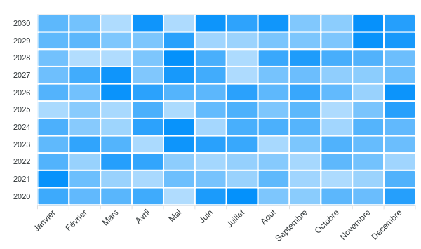
HeatMap
With a single color to highlight density:
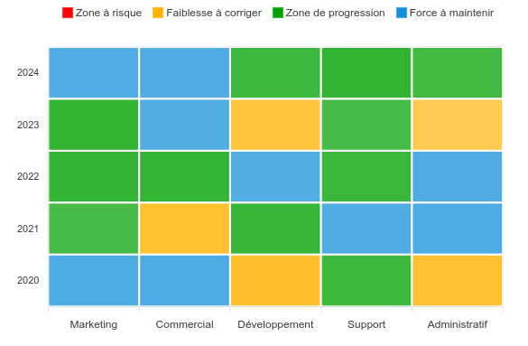
or a multicolor version when you have a specific color scale:
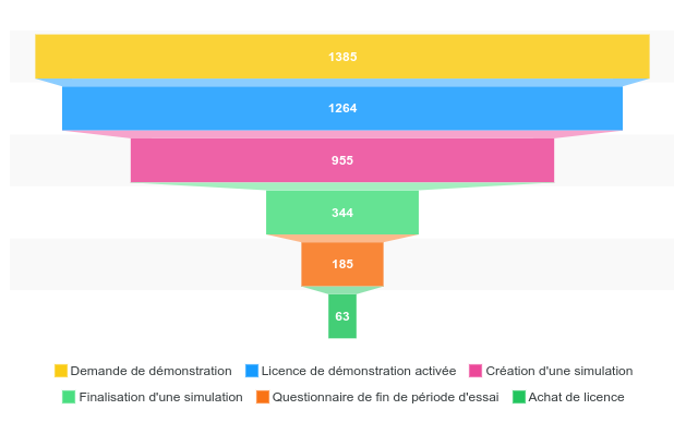
Tunnel
A chart particularly suited to all visualizations of conversion rates and process progress.
Advanced behaviors
Distribution zone
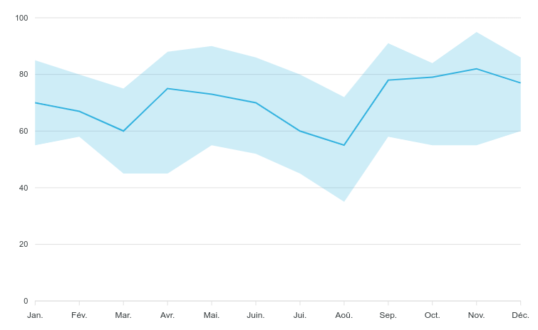
When working on an indicator, the average or median gives a too global view to detect problems. In fact, it's important to also pay attention to the score range to visualize the min and max.
Our online graphs now include the option of adding visualization of the maximum and minimum lines.
Viewing a forecast
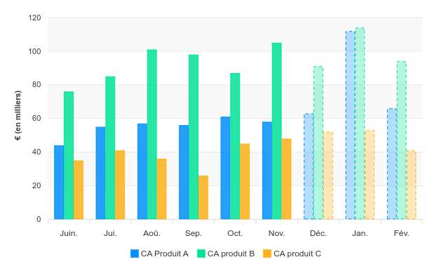
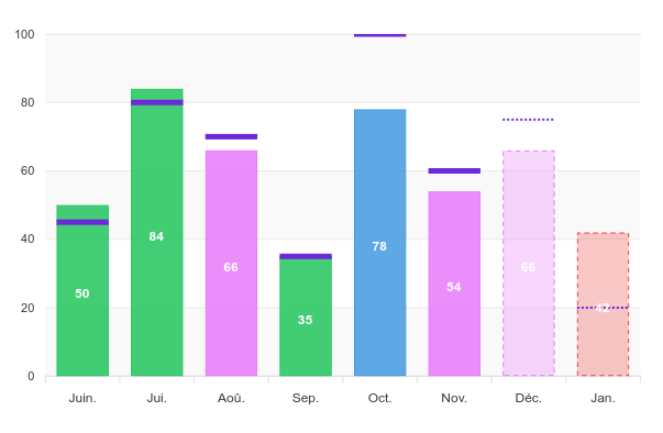
Some charts can be enhanced to include a preview of indicators. This can be done by a system of dotted lines or opacity, depending on the chart.
For forecast calculation, we can calculate a ratio with the previous period and project it onto future results.
Annotations
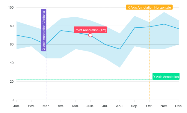
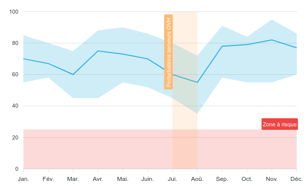
To make it easier to interpret results, you can include annotations in the form of points, lines or zones.
Marker with target
We can now integrate a marker to represent the objective to be achieved. This function is generally coupled with a change in the color of the bar, depending on whether or not the goal has been reached.
This mode can be combined with the forecasting mode.
Conclusion
With SmartPlatform version 1.7, you'll be able to include modern visualization screens with advanced features that will help you better understand your metrics and improve your business.