Release 1.8
For the last release of the year, we improved our components to build better screens and make our software pleasant to use.
Select improvement
Images & icons
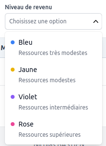
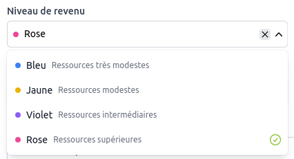
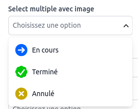
Our select was nice, but when you use it to set persons, enterprise with logos and countries it's nice to be able to view the associate image.
Now select can render image or icon in the option list and selected value.
Badges
When you want to edit the status of a workflow or tags that are displayed as badges in the application, now you can visualize this badge rendering directly inside your selects.
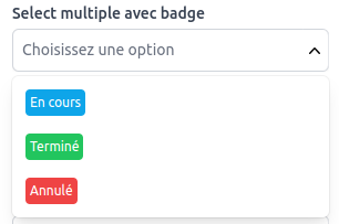
This behavior is also available for multiple values :

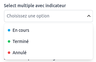
Indicators
When you want a lighter color marker to integrate it smoothly in your forms, the indicator behavior is more adapted.
Background
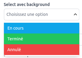
And on the other side, if you need a more obvious color visualization, the background rendering is the last rendering type available.
For example, we have implemented project dependency tracking tables with this rendering style.
Help text
Before release 1.8, we were able to add help text to options for radio and checkboxes but this feature was not available for selects.
Here is how it looks like now :
| With help under the label | With help on the right |
|---|---|
|
|
Progress bars
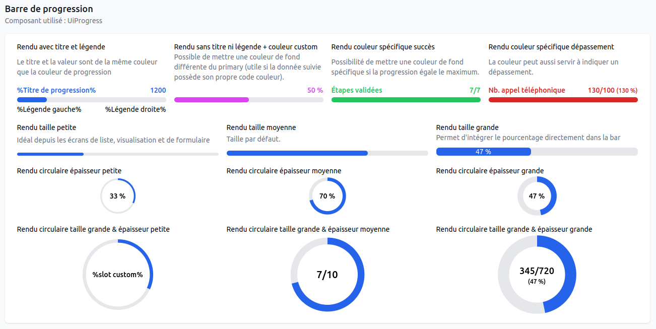
The progress bar is the best component to follow progression. We had a basic behavior with a single color but in real project, progress bar has to express more information.
Now with this release, you can have :
- color changing based on the score
- a specific out of range mode
- text integration inside or outside the bar
- and a circle rendering
Progress bar can be integrated inside your list :

Date picker date range
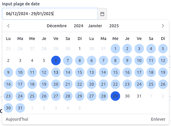
We improved our datepicker to add a date range behavior which is more user-friendly compare to the date from / to format we use to implement with 2 inputs.
New counters bar
For advanced screens which needs to organize counters in groups, we added a new counter bar components.
Like the previous one, you can configure icons, tooltips, help and legend text.

Chart maps
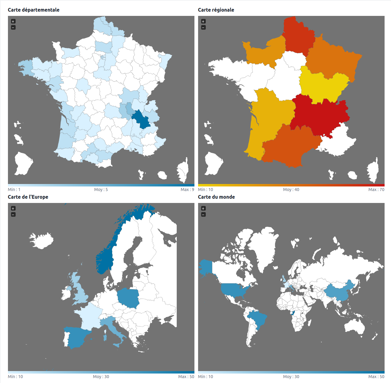
In the previous release 1.7, we already added a lot of graphics to build beautiful statistics screens. In 1.8, we created a new map component that allows us to display the density of indicators by geographic zone, country or department.
Switch component
When we crafted forms to handle user preferences or parameters, Switch component has a better look and feel than traditional checkboxes.
Here is how our new switch looks like :

Conclusion
As you can see, release 1.8 gives you a lot of nice components improvements to make your application screens look better. This is not only cosmetics, all this behaviors help us build more understandable forms and filters so your users are more efficient on their daily tasks.
